Background
Problem
In the current digital age, pet owners expect easy access to their pets’ vaccination records. However, despite the importance of vaccinations, less than 3% of active app users utilize the digital vaccination booklet feature on the Felmo app.
Solution
To address this issue, I spearheaded a comprehensive redesign of the vaccination booklet feature, aimed at improving user engagement and satisfaction. This involved a complete overhaul of the UX flow, incorporating educational content and guidance to help users better understand the importance of vaccinations and how to keep their pets healthy.
At the time of writing this, (May 2023), the feature is currently being deployed.
Company
Felmo, Mobile Veterinarian
Felmo is a mobile vet, meaning we offer various veterinary services conveniently and stress-free at customers’ homes. With the free native app, you can easily keep track of appointments, medical findings, medications & reminders, while also using it as an educational tool to learn how to best keep your pet healthy in between vet visits.
Role (Full time Senior Product Designer)
- Product Vision & Concept
- Initial Research
- UX Design
- Copywriting (English)
- Illustration
- UI Design

Understanding the Problem
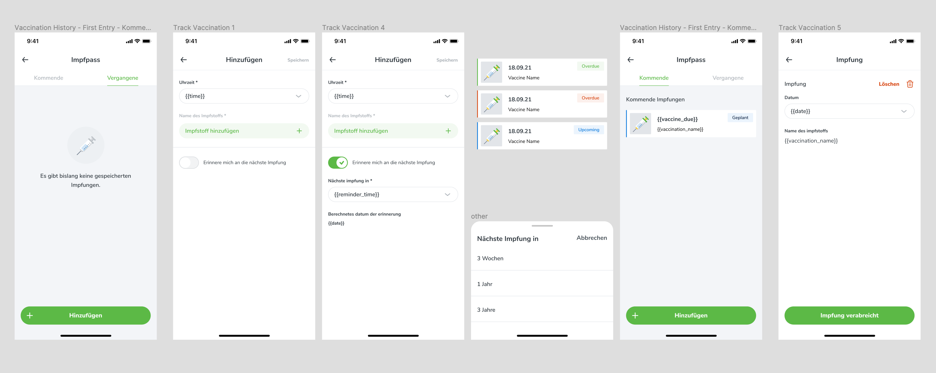
Looking at the current flow, what problems do people have with our digital vaccination pass?
1.
No Guidance
- The current vaccination screen on the Felmo app lacks clear guidance for users, which can lead to confusion and incomplete vaccination records.
- Unlike our competitors, who provide clear prompts when a vaccine is missing, our app simply displays an empty screen, leaving users unsure of what vaccinations are required and when they are due.
2.
No Vaccination Status:
- Currently, when adding a vaccine to the app, users are only prompted to enter a “good from” date, with no option to add an expiration date. As a result, users are left to manually track the expiration of their pet’s vaccines, which can be challenging and time-consuming.
3.
Unhelpful Reminders
- Due to the lack of information on vaccine status, the app is unable to provide personalized, timely reminders for upcoming vaccinations.
- While users can set up their own reminders based on their knowledge of their pet’s needs, as the primary source of health information for pets, veterinarians should be the ones providing customized vaccination reminders to pet owners.
Data & Insights
I spoke to a handful of pet-parents who have vaccinated their animals, then looked into tracked feature usage data.
Main Take-aways
-
Rescue dogs and cats typically come with pre-existing vaccinations and documentation, which may not be compatible with our database due to non-German vaccines.
-
While users may not have a comprehensive understanding of necessary vaccinations, there is a level of curiosity and interest in this information, which could potentially drive engagement with the app.
-
Users rely on a variety of methods to remember when their pet’s vaccinations are due, including calendar reminders, annual checkups, and reminder cards from their veterinarian.
Feature Usage
According to our tracking data, in the last 4 months, an average of 3.23 % of active users per week added a vaccination.
Out of all vaccines added, roughly 14 % are added by the user and 86 % are added by the Vet. (If the vet adds the vaccine, the user may/may not view it in the app).
Findings
These findings suggest that while there is a clear need for a vaccination feature, there is a significant lack of user engagement with the current design.
By addressing the shortcomings outlined in the previous section and incorporating user feedback, we can create a more user-friendly and effective vaccination book feature that meets the needs of our users and encourages greater engagement with the app.
Hypothesis
By infusing the feature with more educational content, recreating the UX flow so that we have better onboarding & reminders, and using a vet’s voice to convey urgency & need, more users will actively use this digital vaccination diary.
Iteration Process
I began by learning as much as I possibly could about dog & cat vaccines in Germany
Closing the Knowledge Gap
I conducted extensive research over the course of several days. This involved reviewing translated veterinary papers and consulting the nation-wide database to ensure accuracy. I also worked closely with one of our veterinarians to confirm my findings.
During these discussions, it became clear that while we can provide guidance to users, we are not legally allowed to provide specific recommendations for each animal. Nonetheless, by incorporating educational content and guidance into the UX flow, we can help pet owners make more informed decisions about their pet’s health and vaccination needs.
Initial Wireframes
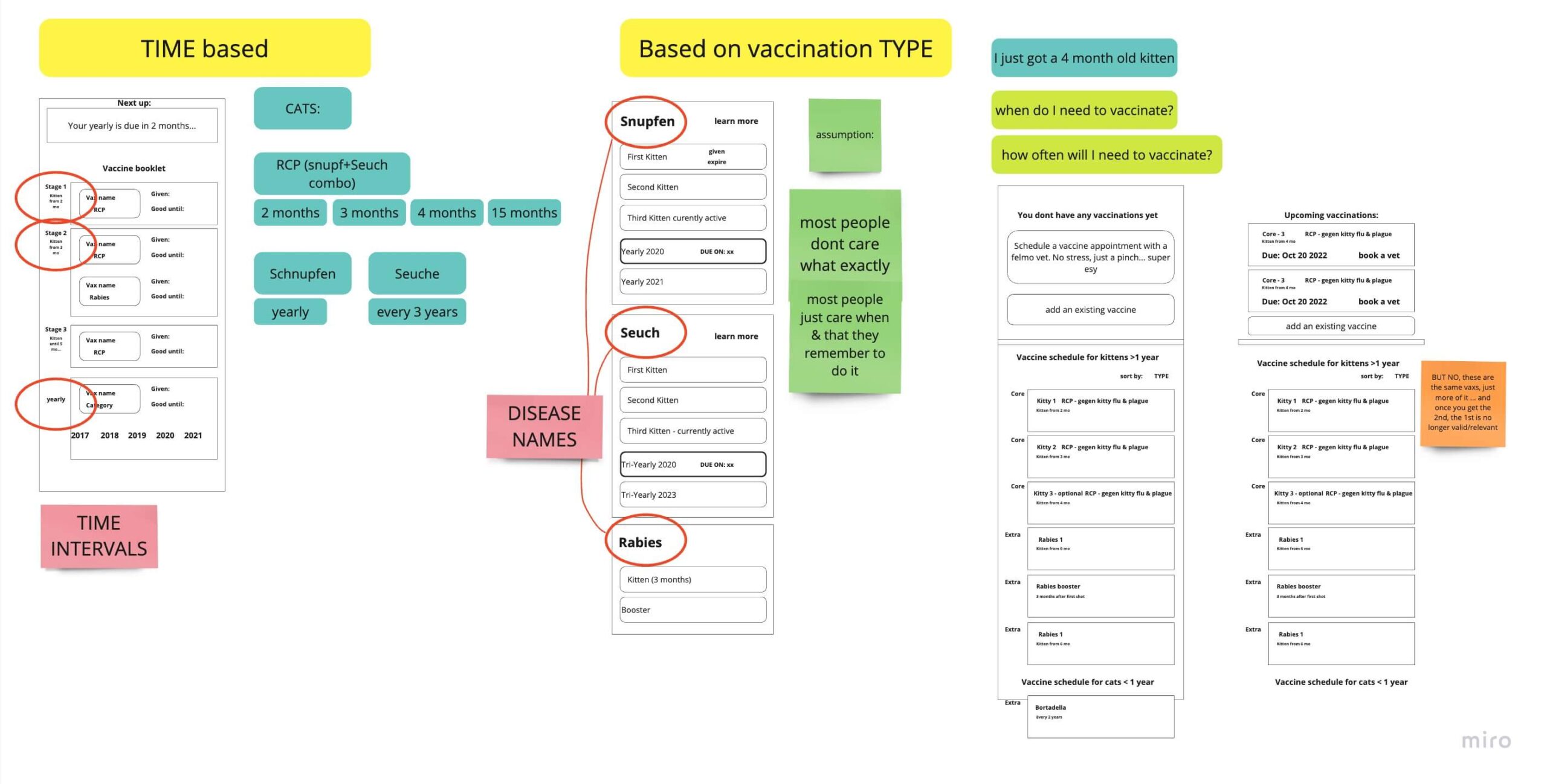
My initial two ideas were to organise the vaccines as either a TIME-based or TYPE-based to-do section.
- With the time-based approach, users would have an idea of how many vaccines they need and how often.
- With the type-based approach, users would see that their animal is either actively vaccinated or not against whatever disease it is.
First Decision: Type-based
In the end, the time-based approach would NOT work, since the validity time changes depending on the manufacturer, and the vets don’t always use the same brands as eachother.
Iteration on Wireframes
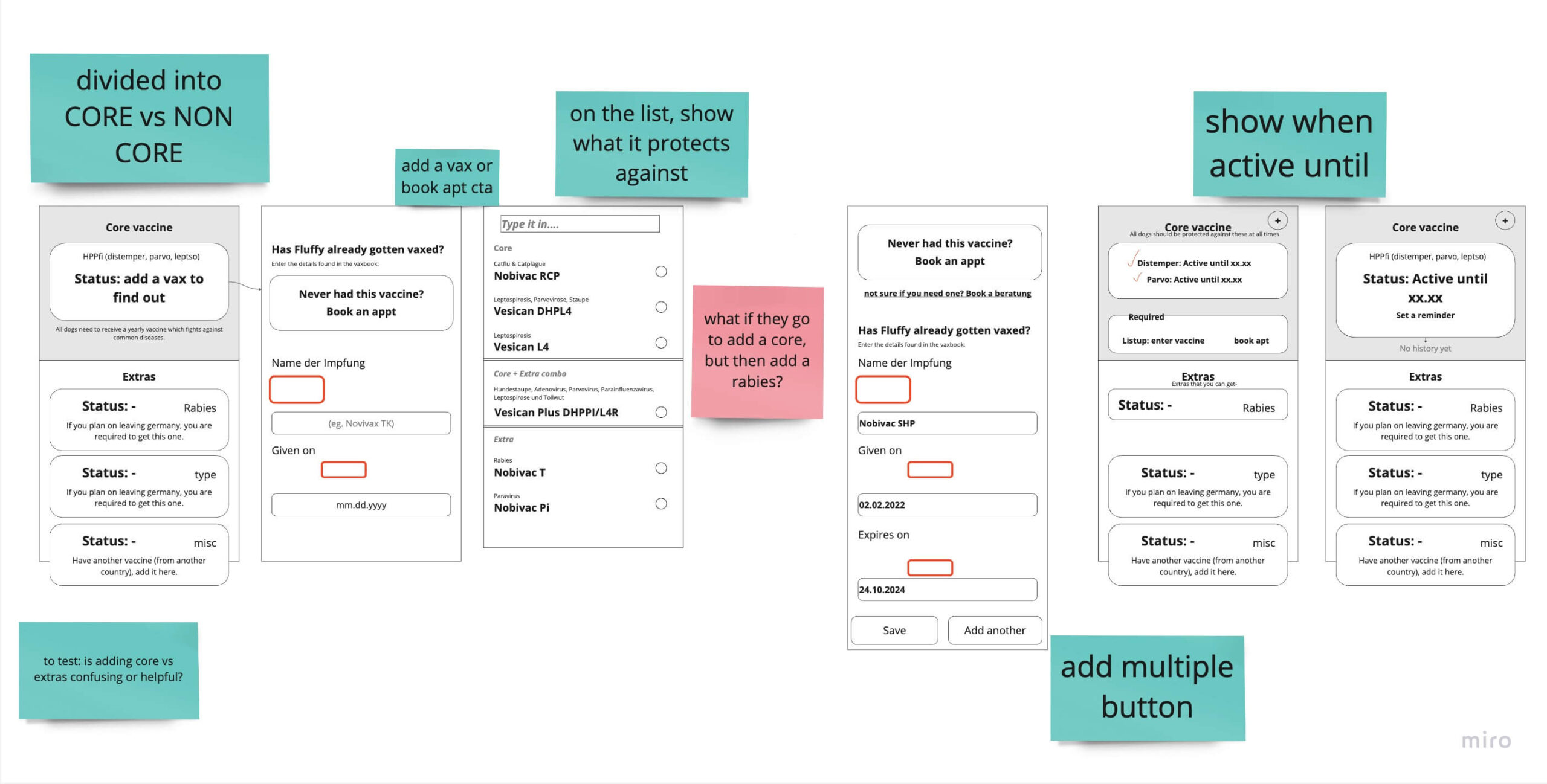
After deciding to organize vaccines based on type rather than time, I created refined wireframes for testing within the office. One of my main concerns was whether separating core and non-core vaccinations would be confusing for users.
Initial Learnings from Tests
-
Through testing, I learned that users need to quickly and easily see if they are missing any necessary vaccinations, which should be prominently displayed at the top of the page.
-
Additionally, when adding a vaccine, we need to provide information on what it protects against to avoid confusion.
-
Furthermore, splitting core and non-core vaccinations proved to be a helpful organizational method, as it provided users with a clear understanding of which vaccines were most important for their pet’s health.
Traffic Lights
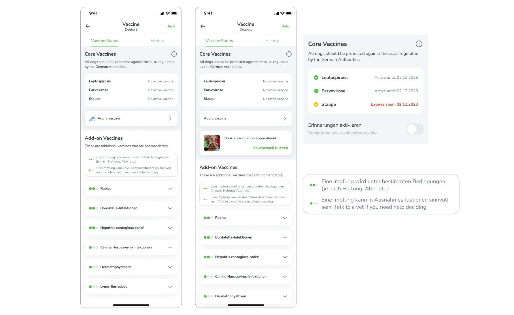
During the research phase, we discovered a dot system that rated the importance of each vaccine, and we considered implementing a similar system using traffic lights to indicate the urgency of each vaccine. 3 dots is mandatory, 2 is recommended, and 1 is not necessary.
We thought that something similar would help our users understand this complex topic quicker.
Why This Did Not Work
After extensive user testing, we found that the traffic light system led to confusion and frustration among users. They had difficulty understanding the rationale behind the rankings and found it added unnecessary complexity to the already intricate task of managing their pet’s vaccinations.
Ultimately, we abandoned this idea in favor of a simpler, more intuitive approach that better served our users’ needs.
Diseases in Focus
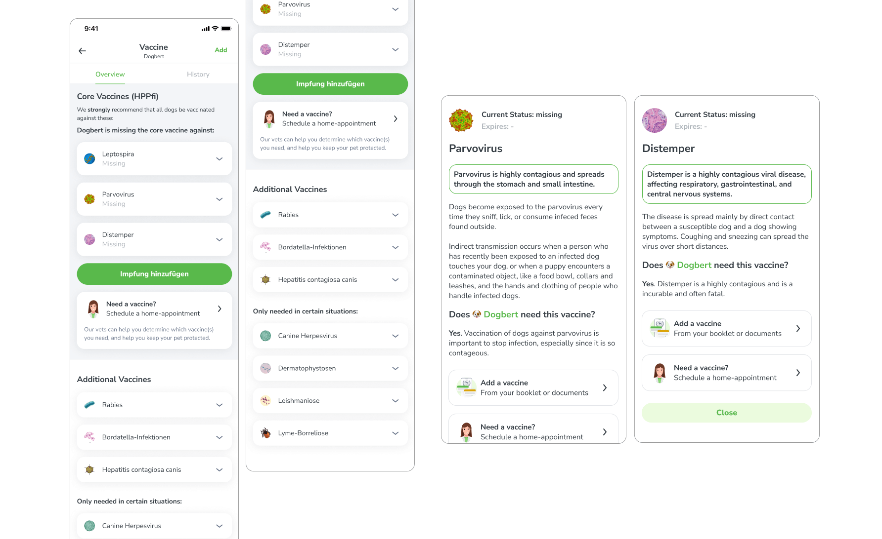
Following the removal of the traffic lights, the list appeared dull and unlikely to engage users effectively. To enhance visual appeal and improve user comprehension, an image of the disease was incorporated.
The objective was twofold: to enhance visual appeal and to signify that the list itemizes diseases rather than vaccines.
Success
Upon presentation of this iteration to the same focus group that had evaluated the traffic light design, a unanimous consensus was reached that the revised design was more lucid and comprehensible.
Solution
Educational overviews, guiding the user through complicated flows, and reminders – all in one flow.
The Solution, Delivered
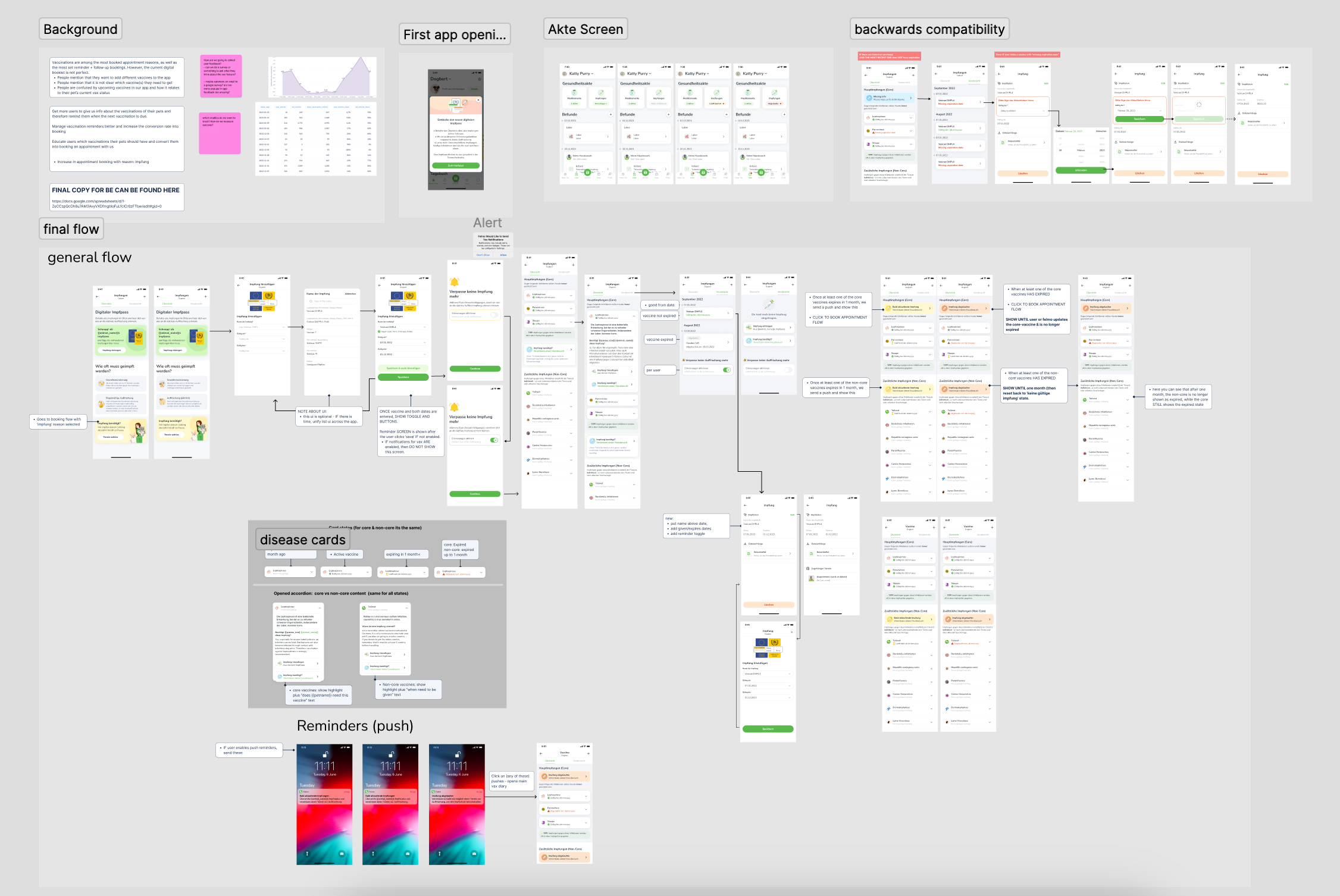
The final flow has been developed based on the findings from the research and the iterative wireframing process. This updated vaccination diary is designed to assist pet parents in maintaining their pet’s vaccination status.
Backwards Compatibility
To ensure that current users can take advantage of the new vaccination feature, it is important that their existing vaccination records are updated with the expiration dates. In order to encourage users to provide this information, we have developed a flow that prompts them to do so. This will ensure that their pets’ vaccination records are complete and up-to-date, and that they can take full advantage of the benefits provided by the new vaccination diary feature.
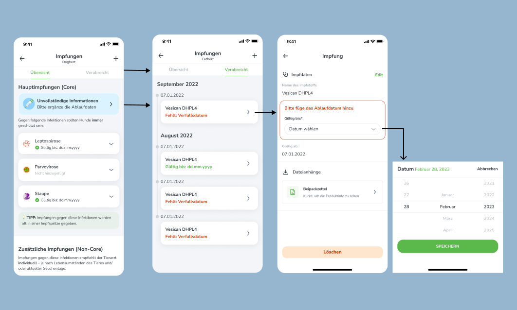
Guidance – Add a Vaccine
When adding a vaccine, we guide users through the process by:
- Displaying an illustration of where to find the vaccination information in their pet’s booklet or passport.
- Providing clear information about the diseases that each vaccine protects against.
- Offering an easy opt-in for reminders to help users stay on top of their pet’s vaccination schedule.

Expiring & Expired Vaccines
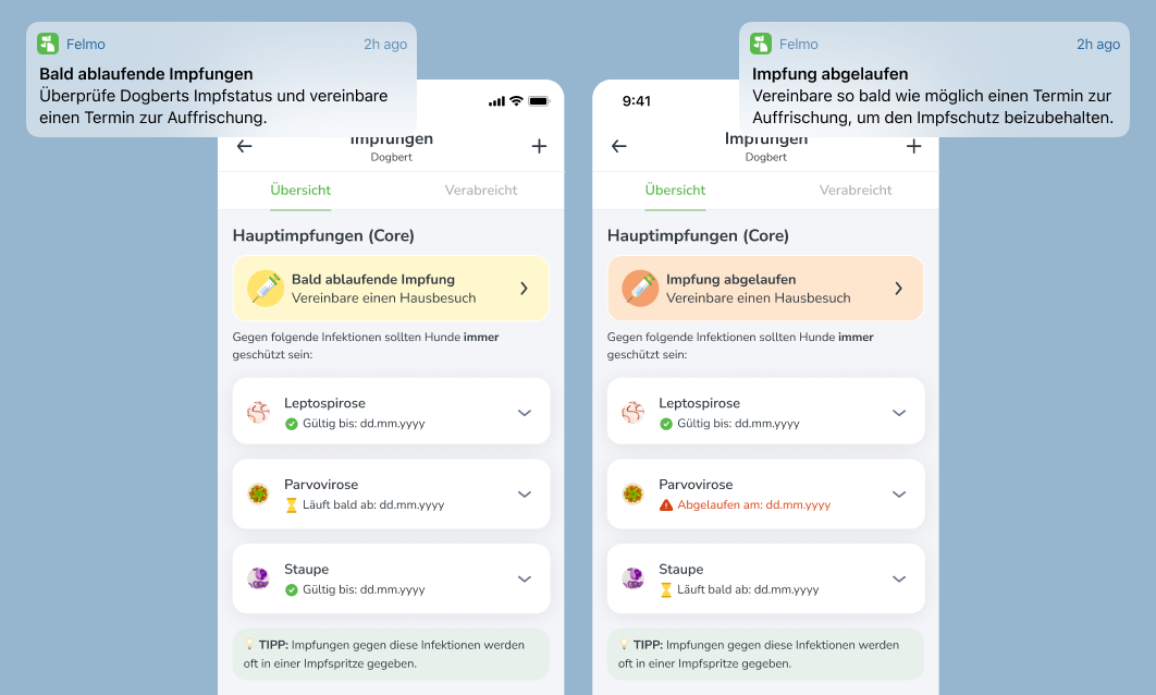
The previous iteration of the feature lacked a clear indication of whether a vaccine was approaching expiration or had already expired.
In the current version, however, users are notified through both in-app alerts and email reminders when a vaccine is due to expire or has already expired.
Additionally, this information is now prominently displayed on the user’s screen, ensuring that they are always aware of the status of their pet’s vaccinations.
Conclusion & Learnings
Easier to understand, even when it feels more complex.
“I actually love this feature. It seems complicated, but it’s actually really simple… it’s a complicated process that you made easy.”
– Chafik (Frontend Developer)
Tester Approved
When testing this final design with potential users, I received an overwhelmingly high amount of positive feedback.
- Very easy to use, straightforward
- Good first impression – seems helpful
My Take-Aways
Internal testing is still valuable:
- I really wanted to test with REAL users, but it wasn’t feasable. Instead of getting stressed about that, I realised that IT IS OKAY to do user tests in the office with coworkers. They are still users and it doesnt make the test any less valid because I know them.
Nothing is ever 100% perfect:
- Vaccines are complicated, and you cant make EVERYONE happy. Some users are going to be confused, and thats okay.
Never skip the process:
- Spending longer on wireframes than I normally do helped me have a clearer picture in my mind of what could and wouldn’t work.
Test test & test to catch your biases:
- Just because I think something is bad UX doesn’t mean it actually is. Hence, testing almost daily is important so that I don’t get stuck in silos

