
A New Look & Feel
A quick look at how I redesigned 5 main screens to both align with the new brand identity and address current UX issues.
Elevator-pitch style, what is Humanoo?
The Humanoo app is a corporate health and wellness system, focusing on education, sport, and mindfullness. Users get points for engaging in healthy activities and can redeem these for rewards from their employers.
Background:
In 2020, humanoo was expanding and hired a marketing manager to build up the almost non-existent marketing department. One of the first initiatives of the marketing department was to improve the corporate brand identity of the company (not the product). The marketing and C-levels created a new identity, which focused on the principle of “happiness”. The color yellow was chosen, since it is different than competitors, and is a generally optimistic color.
The Problem:
Over the next year, the corporate brand of Humanoo was refined and perfected, but the visual identity of the product (app) itself was still using the old style. The disconnect between corporate brand identity and product identity caused confusion for users, clients, and even internal stakeholders.
The Task:
Before I left the company, I was asked to help them create a ui vision for the app with the new colors and brand identity. The idea was to use this as a guide for improving the app over the next few months. The best part, they said I did NOT have to stick to the constraints of the current UXUI, but rather create a design which I believe would both look good and function better.

Ideation Process
1. Inspiration
The first thing we did was ask the CEO & CMO to post screenshots of apps where they like both the UI and/or the UX. We also added our own screenshots and notes. After two days, we had a huge collection of potential inspiration. Using the screenshots as inspiration, I labeled some high level categories which we could focus on, such as “background, colors, depth, navigation, page structure”

With these labels, I then grouped the screenshots depending on the categories that they share. Two big differentiators were “drop shadows vs. no drop shadows”, which changed the entire look and feel of the apps.

New design

The changes:
1. Discover Screen
The discover screen is where users can find random sessions and recipes, and companies/marketing can post teasers. – It is important to note that the discover screen is NOT a library, but it is rather a place that suggests content that the user might like.
Old

Problem:
- The big top image takes up too much space, especially on small devices. Users don’t know that they can scroll.
- The titles on the cards get cut off if they are too long.
- Users don’t know how long a session will be unless they click on the card.
Redesign

Solution:
-
The top large image is replaced with a branded teaser, where marketing and key account can communicate with the user.
-
Below the new teaser is the ‘content discovery’ section. Much like Netflix, this part of the screen would fill with different types of sessions based on the user’s preferences and activities.
2. Coach Screen
The coach is where users can add longer programmes, where they get a new session every day in their selected category.
Old

Problem:
- The screen seems to have similar content as the discover screen, so users don’t understand the difference between programmes and sessions and why they are in different places.
- Users often complain that they can not go back to the session they did yesterday.
Redesign

Solution:
- The first thing that we did is combine the coach and discover screen. The ‘coach’ has become a ‘To-Do” tab on the discover.
- Users can see the programmes they have added, the duration, and what they have done previously.
- Below the added programmes, we added a “to-do” component where users can get a list of daily tasks.
3. Challenge Screen
The challenge screen is where users can join and participate in step count, cycling distance, and other company health challenges.
Old

Problem:
- The un-joined challenge on the top of the screen takes up a lot of space and does not look clickable.
- There are many inconsistent components on this screen that have different properties.
Redesign

Solution:
- Instead of putting un-joined challenges on the top, we have ongoing challenges as the first thing the user sees, as it is likely more relevant.
- There is a progress bar on the challenge card so that you don’t need to click into a challenge to see high-level information.
- The new un-joined challenges are split into categories, so that users can easily navigate and then join what interests them.
4. Progress Screen
The progress is where users can see how many points they have collected for doing ‘mindfulness’ ‘exercise’ and ‘educational’ activities in and out of the app.
Old

Problem:
- The main problem is simply the colors. Since the new brand color is yellow, the ‘educational’ points can not be yellow.
Redesign

Solution:
- The progress circle colors were changed to better align with the new branding.
- In the circles, instead of x/x, I included a percentage to make scanning relevant information easier.
- ‘Daily activities’ was reformed into ‘all activities’, and the user’s dashboard is displayed in a minimal but useful way.
5. Exercise Screen
The exercise screen appears when a user is doing a workout or mindfulness session.
Old

Problem:
- The video is very small, and users complain that they can not see the exercise clearly.
- It is not possible to see what exercise is coming up next.
Redesign

Solution:
- The video is full screen (and can be portrait or landscape).
- The bottom green progress bar is shown now as a circle around the remaining duration.
- You can see what exercise is next up.
- The entire duration of your session is shown on the top left corner.
Bonus Design
For fun, I created a new hamburger menu design, pushing the boundaries of what could be implemented. Of course, when I showed the developers, I was met with “this looks amazing but would be hard to implement.” But honestly, it was more about playing with figma’s prototyping solutions (this was made in 2020).
In conclusion
What made this redesign successful is that we were in constant communication with multiple C-level stakeholders. Throughout the process, we would get feedback to make sure we are aligned with the vision moving forward.
I did not do any user testing, and since my changes were based on my personal ideas/bias, it would be beneficial to test these ideas before rolling it out. Since I did this in my last month at the company, I was not part of the implimentation, so I hope it was properly tested and iterated on before rolling out. However, I’ve been in contact with my former colleagues and boss, and the app is holding strong and business is going well, so I am confident that they handled the implementation well.
How about another one?
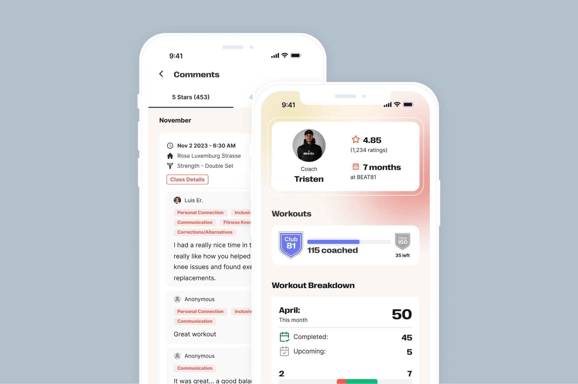
Fitness Coach Dashboard
Creating a valuable, insightful, and beneficial dashboard for our freelance fitness instructors.
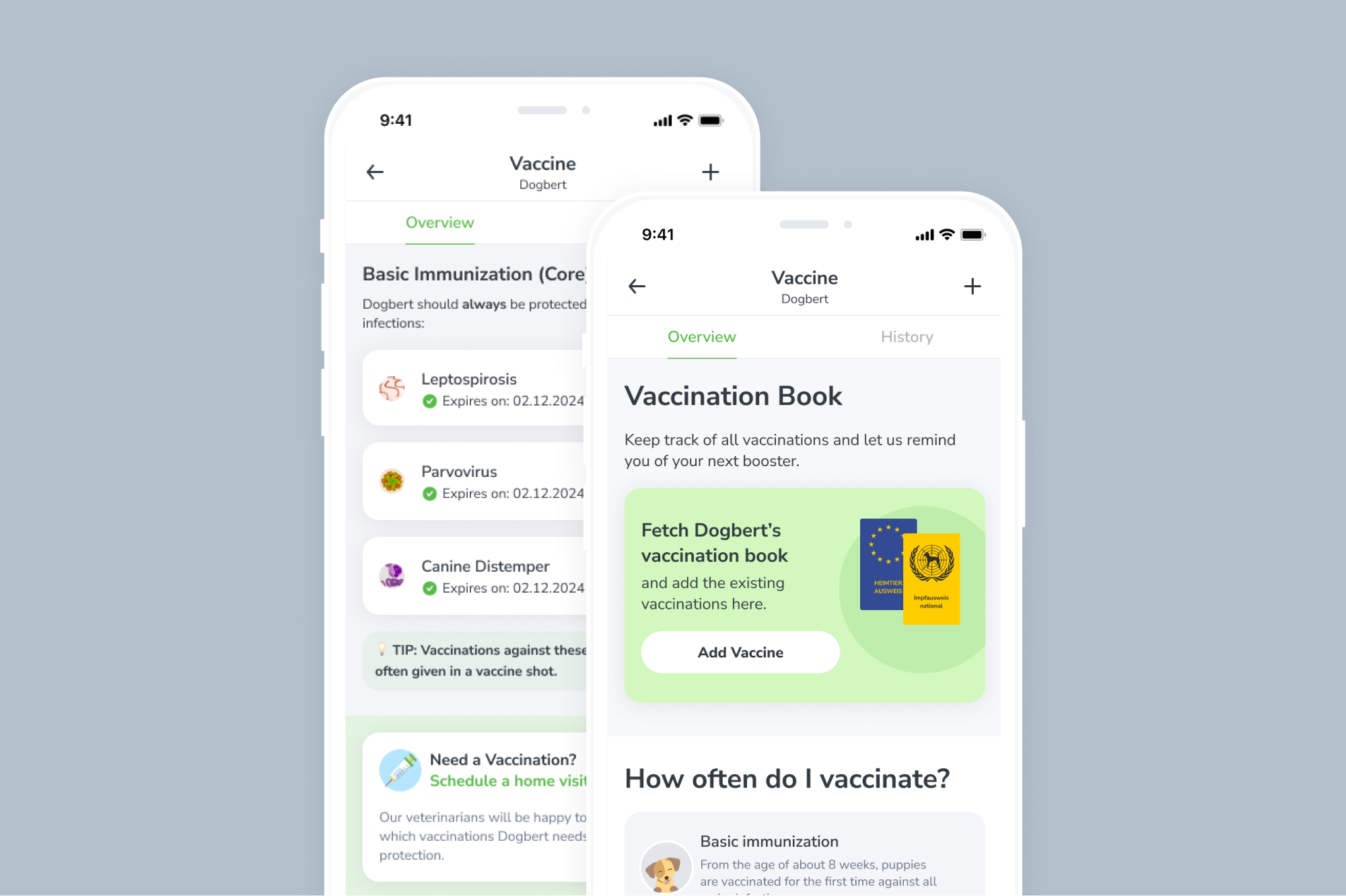
Pet Vaccination Diary
how might we increase the percentage of active app users with a vaccine entry in the app?